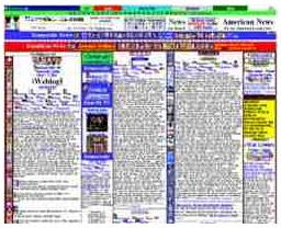
Trying to improve the world wide web... one horrifying layout at a time.

I like the one that looks like it was built by Dr Bonner. You have to trust this thumbnail image, because the real deal takes so long to load I burned my muffins.
The website for websitesthatsuck has its own category names. I have renamed them for my own amusement, but these are their real winners.
Glurgiest: Newcastle Spiritualist Church
Most opthamology kickbacks: Tracy's Karate
Sally on her lunch hour award: Sail New York
People who have not used the web since Prodigy: Sarasota Tampa Express
(by the way, this one has blue mountain e*cards style Casio music)
All this taunting of course makes me wonder whether my website would pass the test. I use a Blogger template (which I have considered changing, but I fear a Facebook style backlash). Websitesthatsuck offers a checklist you can run through, but they warn that you if don't know anything about web design, you may not understand the checklist.
I use this template (which is called Scribe) because it comes the closest to the Mill Girl vibe I am trying to cast. While talking about ViewMasters, contemporary art and the Prophets. Which is probably a mark of a website that sucks content-wise if not format-wise.
Well you know what I say to that.


Oh. My.
ReplyDeleteI visited the site "Sail New York" and based on the photo I'm thinking there is probably one more thing you should not forget to bring if you go.